


Unlike the rest of the real estate category, Squareyards are dedicated end-to-end providers. From documentation to delivery, their services are made for buyers tired of a complex, cumbersome system.
I developed the brand identity concept.
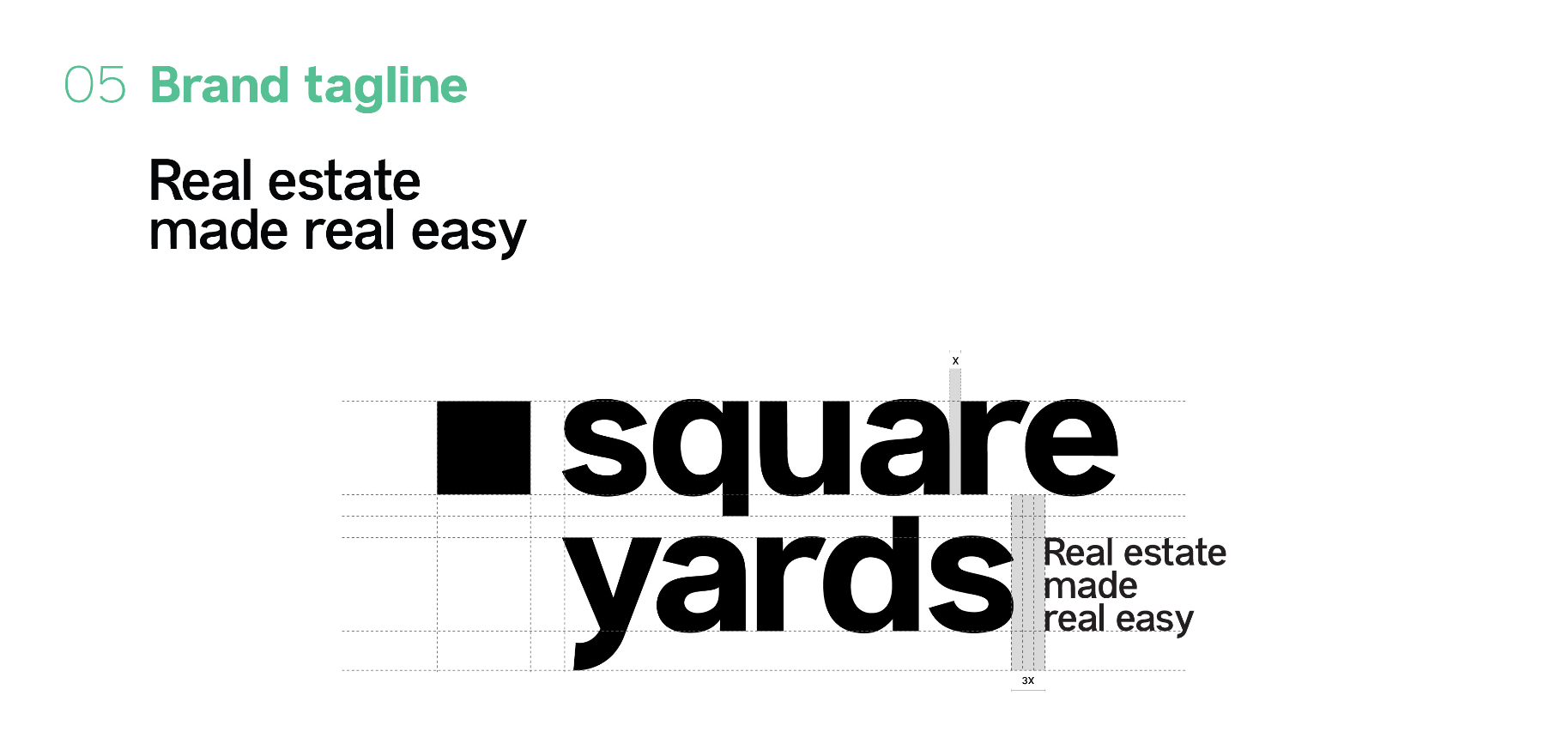
Echoing the brand purpose of ‘Real estate made real easy’, we went in a literal, unadorned direction with the logo, choosing to own the simple square as the brand device. Set in Anderson Grotesk, the wordmark is low-key by design, in contrast to the overworked, outdated visual language of the category. The logo also complements the identity system (scroll down), yet exudes a polished confidence when on its own.
A similar restraint carried over to the palette, where two pleasant yet mature shades of green and purple were chosen for use as accents. The shades were borrowed from two cues of the category—the traditional folders in which real estate documents are usually stored, and the stamp ink with which they are made official.
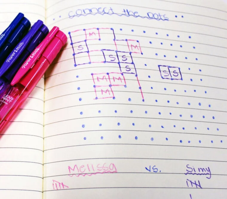
Dreamt up by French mathematician Edouard Lucas, the dots-and-boxes puzzle is a game that virtually every Indian has grown up playing in their school notebooks.
In addition to the squares motif, there was another relevant twist for the brand. Each complete square, marked with the initial of its owner, is vernacularly called a ‘ghar’—Hindi for ‘house’.
First-time buyers contend with risk and red tape that comes inbuilt with the industry. The visual metaphor of the ‘ghar game’ helped us highlight the brand’s commitment to ease and transparency.
A grid-based system also gave us the flexibility to adapt to different collateral, and it could easily accommodate text and images alike.