Setu
Setu make science-backed supplements with practical usage in mind. That is to say, they do lots of work in the lab, and then lots of work to actively ensure users are not popping pills that they don’t need. With lots of ethical exposition to do and important info to convey, they first needed a platform. Then, they need a visual language and a nomenclature system that could grow with the brand.
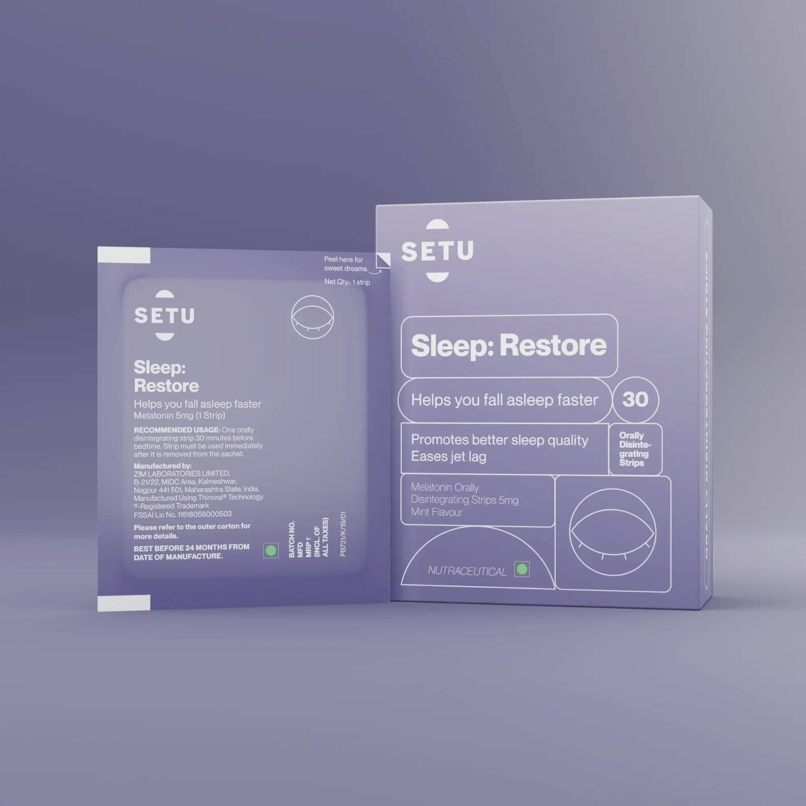
I developed the brand platform and tone of voice. Additionally, I also supplied the visual identity concept, which my talented design colleagues helped bring to life. Setu’s design language picked up a Gold at the 2022 Dieline Awards under the Pharma category.

Supplements That Make Sense
Supplements aren’t quite as mainstream in India as they’re in the west, presenting both a challenge and an opportunity. As dedicated first-movers, Setu had to prove that they knew the science better than anyone else. The second task was to dispel the various myths associated with the category. All this, while explaining their purpose to an audience that’s already inundated with various other branches of ‘alternate medicine’ and thus might be reluctant to trust something new.
The direct and hardworking brand positioning, then, followed the theme of ‘common sense’—science made practical.

The tone of voice needed to be honest without making it a gimmick, unlike a certain oat milk brand, for instance. Along with other counsel, the Setu team was encouraged to push users to consult doctors before popping the pills—a not-so-small detail that further inspires trust.


Names in the supplements category often tend to go for cheeky puns that overstay their welcome. To account for Setu’s ever-expanding portfolio, we went with a simple naming system—the part of the body that is affected, and the nature of said effect.
This meant nomenclature could be specific when needed, but also had room for playfulness. Like how sometimes replacing ‘stomach’ with ‘tummy’ made for a friendlier feel.

